
Its templates cater to various blog styles, from text-focused to image-heavy layouts. Additionally, it supports international typography and diverse color palettes, ensuring accessibility and customization for users worldwide.
Quick specs
- Requires at least WordPress 6.7.
- Requires at least PHP version 7.2.
Site editing support
Twenty Twenty-Five is designed to support site editing features, including:
- Site Editor: an editor that allows you to edit all parts of your site, navigate between templates, create new pages, and more.
- Styles: a feature that allows you to customize your site, including individual blocks, as much as you’d like with different colors, typography, layouts, and more.
- Select from multiple color palettes and font pairs, or download and install your own fonts.
- Templates: edit, create, and manage templates used by pages, posts, and other content.
- Patterns: build your site with the help of pre-made designs, from full-page designs to smaller elements.
A versatile set of template designs
The theme features a versatile set of templates, site headers and footers.

How to switch template designs
To change the design, you must first open the template in the Site Editor and select the design from the sidebar.
- Open the Site Editor from Appearance > Editor.
- Select Templates.
- Chose which template you want to update.
- In the Site Editor, open the Settings sidebar and select the Template tab.
- Open the Design panel.
- In the Design panel you will find the previews of the available template patterns. Click on the pattern that you want to use.
- Save the changes to your template and repeat the process for each template.
Personal Blog (Default)
The default blog templates have an incredibly simple, straightforward layout suitable for any post (with or without a title, with or without a featured image, long or short). The templates also show the entire post’s content, not just excerpts.

Text-Only Blog
The theme offers a template option for those who want to keep their blogs text-only, both for the home page, archives, search as well as the post.

Photo Blog
The photo blog templates are tailored primarily for photography or portfolios lean on an image-heavy approach, with interesting layouts that can be used for a variety of purposes.

News Blog
The news blog has three advanced home page designs to choose from. The default news single post template includes a sidebar to the right of the content.

Additional templates
Vertical header, right-aligned
This alternative blog design featured a split layout built with the columns block. There’s a narrow vertical header with the menu and site title are on the left, and all the content is on the right.

Single post with left-aligned content
This alternative template features a more opinionated top section displaying a left-aligned post title and post author in the left column, and the featured image on the right column. Below this section is the post date and categories. The post content is also left-aligned, creating an offset layout that works harmoniously.

Single offset post without featured image
This alternative template displayed a large post title followed by the post categories. A separator divides this top section from the content section below it, which features a two-column layout with the post date on the left and the post content on the right.

Page without page title
This alternative template is most suitable for pages where you only want the content to be visible, not the page title or featured image.

This template can be useful if you want to create a landing page using one of the full-page patterns available in Twenty Twenty-Five, as shown in the example below:
Edit templates and pages in Zoom Out view
With WordPress 6.7’s Zoom Out view, you can get a broader view of the template or page you’re editing. You can add, arrange, shuffle, or remove patterns as you see fit.
Style variations and presets
Twenty Twenty-Five has nine style variations with unique color palettes, font families and typography settings.
Each color palette and font pair are also available as individual presets, which means that you can combine them in any way you want.

The default style variation of Twenty Twenty-Five uses the font Manrope for headlines and paragraphs. This style has white with dark grey and accents in yellow, pink and purple.
The alternative fonts shipped with the theme are Beiruti, Fira Code, Fira Sans, Literata 72pt, Platypi, Roboto Slab, Vollkorn and Ysabeau Office.
Patterns
Twenty Twenty-Five features more than 70 patterns, including Section Patterns such as About, Contact, Call to Action, Events, Hero, Services and Testimonials as well as Full-Page Patterns such as Landing and Home Pages.

Full Page Patterns and Landing Pages
The landing page patterns can be inserted when you create a new page. They include:
- Event RSVP
- Business homepage
- Coming Soon
- CV/Bio
- Landing page for book launch
- Landing page for an event
- Landing page for a podcast
- Portfolio homepage
- Shop homepage
Section styles
You can use section styles in your content or templates to create a diverse design and highlight or separate different content types. A section is created by inserting a columns or group block and selecting one of the six section styles. Each section will have a unique accessible color combination based on the current color palette.
Text styles
Text styles can be applied from the Styles section in the Settings sidebar. The heading and paragraph blocks have three custom text styles:
- Display
- Subtitle
- Annotation
Block style variations
Block style variations can be applied from the Styles section in the Settings sidebar.
List block with checkmark:

Pill-shaped tags:

Post Formats
The theme registers support for all post formats: aside, audio, chat, gallery, image, link, quote, status, and video. To style your post formats differently from your other posts, you can use section styles and patterns in your content.
The theme includes three patterns for post formats:
- Post format name (Displays a single word, for example “Video”)
- A premade design for the Audio format
- A premade design for the Link format

How to include Post Formats in Query Loops
You can use the Query Loop block to list posts with a specific format.
- Insert the Query Loop block.
- In the Settings sidebar, select the Custom query type.
- Next open the Filters panel at the bottom of the Settings sidebar, and enable Formats.
- In the Format option, enter the name of one or more formats.
- Style your query and post template blocks.
Support and resources
Get community help with Twenty Twenty-Five in its support forum.
Learn how to take full advantage of full site editing with the Simple Site Design with Full Site Editing course on Learn.WordPress.org.
Read more about the Twenty Twenty-Five theme in the introduction post.
]]>A block theme designed to take full advantage of full site editing capabilities, particularly the opportunities offered by patterns. Create new pages in a matter of moments by constructing them from the wide range of patterns that come bundled with the theme.
Quick specs
- Requires at least WordPress 6.4.
- Requires at least PHP version 5.6.
Full site editing support
Twenty Twenty-Four is designed to support full site editing’s powerful features, including:
- Site Editor: an editor that allows you to edit all parts of your site, navigate between templates, and more.
- Styles: a feature that allows you to customize your site, including individual blocks, as much as you’d like with different colors, typography, layouts, and more.
- Templates: edit, create, and manage templates used by pages, posts, and other content.
- Template parts: a way to organize and display groups of blocks as part of a block template mainly for site structure, like Headers and Footers.
- Theme blocks including the Navigation block, Query Loop block, and more.
Like its predecessor Twenty Twenty-Three, this theme is designed to use WordPress site-editing features instead of the Customizer, which will be hidden by default. The Customizer may be automatically reactivated if you have plugins that require it.
One theme, many variations
In the past, default themes often centered around a specific topic or style. However, Twenty Twenty-Four breaks away from this tradition. This theme is thoughtfully designed to be your all-encompassing choice for any type of website, regardless of its specific focus.

The Twenty Twenty-Four theme allows users to change certain Templates to use alternative patterns designed for specific use-cases: Business (the default), Writer, and Portfolio.
Alternative patterns
Alternative patterns for the Writer and Portfolio types can be switched to for the following templates:
- Blog Home
- Index
- Archive
- Search
You can use the Replace Template functionality to select one of the alternative patterns for your current template.
- When editing one of the Templates mentioned above – make sure the ‘Template’ tab of the sidebar inspector is selected.
- Click the three dots next to the Template name, and select the ‘Replace Template’ option from the menu that appears.
- You will be shown a selection of alternative patterns to choose from. Clicking to select one will replace the existing template contents with the new pattern.
- Save the changes to your template.
Template Parts
Twenty Twenty-Four also includes a range of different layouts for the Header and Footer of your site. When editing your Templates you can replace the template part with one of the variants.
Custom Templates
Twenty Twenty-Four includes several custom page templates for you to use:
- Page no Title: the layout of a standard page, but with no page title at the top.
- Page with Sidebar: displays page content with a sidebar on the right hand side.
- Page with Wide Image: displays a wide featured-image with page title on the left, and content on the right.
Block patterns
Explore patterns to save time while crafting creative layouts. Patterns are collections of predesigned blocks whose text and media content can be quickly replaced by your own. Whether a call-to-action, an event announcement, or FAQ, patterns can help jump-start the creation of your page or post.

Style variations
Twenty Twenty-Four’s comes with a minimalist, but versatile, palette in monochromatic greys.

Prefer a different look? Visit the Styles area in the Editor and choose from 9 additional style variations to instantly switch up the design, including colors and typography.

Block variations
Twenty Twenty-Four comes with style variations for a number of blocks – allowing slightly different appearance from their defaults.
Heading block
Headings in Twenty Twenty-Four come with a variation that includes an Asterix as a bullet point above the heading.
When editing your headings – you will see an option in the sidebar to switch to the variant style. Selecting the ‘With asterisk’ style will keep the size and font of your heading – but add the stylized asterix above it.
List block
List items in Twenty Twenty Four come with a variation that uses a checkmark as bullet points instead of the default style.
When editing your list – you will see an option in the sidebar to switch to the variant style. Selecting the ‘Checkmark’ style will keep the swap the default bullet for a checkmark.
Details block
The Details block in Twenty Twenty Four come with a variation that uses an arrow to mark the summary instead of the default style.
When editing your Details block – you will see an option in the sidebar to switch to the variant style. Selecting the ‘Arrow icon’ style will keep the swap the default marker dor the summary section to use an arrow icon.
Navigation links
Links within Navigation blocks in Twenty Twenty Four come with a variation that adds an arrow to the right of the link text (sometimes used for indicating a link that leaves the main site).
When editing menu items – you will see an option in the sidebar (Style tab) to switch to the variant style. Selecting the ‘With arrow’ style will add the arrow to the right of the link text.
Category and Tag list blocks
Category and Tag list blocks in Twenty Twenty Four come with a variation that styles each term as a ‘pill’ with a light background.
When the Category or Tag blocks within a Query Loop – you will see an option in the sidebar (Style tab) to switch to the variant style. Selecting the ‘Pill’ style will add a light background color (with rounded corners) to each term in the list..
Design specifications
Twenty Twenty-Four comes with the following defaults for style.
- Cardo Font for headlines.
- Sans-serif System font for paragraphs.
- Instrument Sans, Inter, and Jost as alternative fonts.
- The default color palette of Twenty Twenty-Four is light, providing a fresh and inviting appearance. The Style Variations (mentioned above) contain a range of alternative color palettes.
- A content width of 620 pixels and ‘Wide’ width of 1280 pixels.
Should you wish – you can also view a more complete list of the spacing, color, and layout presets used by the theme. And remember, the Site Editor’s Styles tools give a wide range of options for customizing the style of your site beyond these defaults.
Support and resources
Get community help with Twenty Twenty-Four in its support forum.
Learn how to take full advantage of full site editing with the Simple Site Design with Full Site Editing course on Learn.WordPress.org.
Read more about the Twenty Twenty-Four theme in the introduction post.
]]>
A minimalist block theme designed to take full advantage of full site editing capabilities, Twenty Twenty-Three includes a collection of ten community-submitted style variations. Explore the Styles panel and change the look-and-feel of your site in an instant – bold and bright, or soft and subtle, the choice is yours.
Quick specs
- Requires at least WordPress 6.1.
- Requires at least PHP version 5.6.
Full site editing support
Twenty Twenty-Three is designed to support full site editing’s powerful features, including:
- Site Editor: an editor that allows you to edit all parts of your site, navigate between templates, and more.
- Styles: a feature that allows you to customize your site, including individual blocks, as much as you’d like with different colors, typography, layouts, and more.
- Templates: edit, create, and manage templates used by pages, posts, and other content.
- Template parts: a way to organize and display groups of blocks as part of a block template mainly for site structure, like Headers and Footers.
- Theme blocks including the Navigation block, Query Loop block, and more.
Like its predecessor Twenty Twenty-Two, this theme is designed to use WordPress site-editing features instead of the Customizer, which will be hidden by default. The Customizer may be automatically reactivated if you have plugins that require it.
Templates
Twenty Twenty-Three includes several custom templates for you to use:
- Blank: this displays post content without any additional blocks.
- Blog (Alternative): provides a different way of displaying blog posts, in a list format with the date on the left and the post title on the right.
Block patterns
Explore patterns to save time while crafting creative layouts. Patterns are collections of predesigned blocks whose text and media content can be quickly swapped out with your own. Whether a call-to-action, an event announcement, or a pricing table, patterns can help jump-start the creation of your page or post.


Style variations
Twenty Twenty-Three’s default colour scheme consists of a minimalist black-and-white palette, along with green accents.

Prefer a different look? Visit the Styles area in the Editor and choose from ten additional style variations to instantly switch up the design, including colors and typography.


by @richtabor

by @beafialho

by @luminuu

by @beafialho

by @critterverse

by @nudge

by @amjadr360

by @anariel-design

by @colorful-tones

by @bgardner
Design specifications
Twenty Twenty-Three takes advantage of fluid typography presets, so that each piece of text can adapt to any screen size, automatically. The theme also uses fluid spacing presets, to help maintain consistency in the spacing between blocks at all screen sizes. If you’re interested in learning more about the sizes, spacing, and font families in those presets, check out Twenty Twenty-Three’s design specification.
Support and resources
Get community help with Twenty Twenty-Three in its support forum.
Learn how to take full advantage of full site editing with the Simple Site Design with Full Site Editing Learn WordPress course.
Read more about the Twenty Twenty-Three theme in the introduction post.
]]>
Everyone deserves a truly unique website, built on a solid, well-designed foundation. Twenty Twenty-Two aims to help you achieve that by offering a wide set of patterns, templates, headers, footers, and custom color palettes. As the first-ever default block theme, Twenty Twenty-Two invites you to explore full site editing and create a site that reflects your individual vision.
Quick Specs
- Requires at least WordPress 5.9.
- Requires at least PHP version 5.6.
Full Site Editing Support
Twenty Twenty-Two is designed to support all of the features of full site editing. This includes the following:
- Site Editor: an editor that allows you to edit all parts of your site, navigate between templates, and more.
- Styles: a feature that allows you to customize your site, including individual blocks, as much as you’d like with different colors, typography, layouts, and more.
- Templates: edit, create, and manage templates that a page or posts uses.
- Template parts: a way to organize and display groups of blocks as part of a block template mainly for site structure, like Headers and Footers.
- Theme blocks including the Navigation Block, Query Loop block, and more.
Thanks to these options you should find that you won’t need to switch themes as often to create the desired look and feel of your site.
Keep in mind that Twenty Twenty-Two is designed to use the above features instead of the Customizer to edit your site. The Customizer will be hidden by default, though it may be reactivated if you have plugins installed that require it.
Templates
Twenty Twenty-Two has three custom templates for you to use with your posts and pages:
- Blank: this includes the post content without any additional blocks.
- Page (Large Header): this includes a big, visually interesting headline.
- Single Post (No Separators), and Single Page (No Separators): These are the standard post/page templates, but with no horizontal separators on them.
When exploring these templates and making them your own, be sure to take advantage of the Page patterns that you can use to build your templates. To learn more about templates and how to use them on your site, please read the Template Editor support article.
Block Patterns
Twenty Twenty-Two comes with 64 patterns to create beautiful content from footers, headers, pages, and more. To learn more about block patterns and how to use them on your site, please read the Block Patterns support article.
Here are just a few examples to look forward to:
Subscribe callout

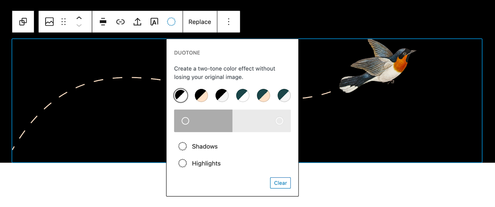
Layered images with duotone

List of events

Color Palette
The theme provides several recommended colors that work well with the design of the theme. You can use these colors throughout your site including when customizing your site with the Styles feature or when customizing individual blocks. Duotone filters are also included as part of the color palette options so you can easily have all aspects of your site embrace a shared palette:
Black
White
Dark Green
Beige
Light Grey
Support and Resources
Get community help with Twenty Twenty-Two in its support forum.
Learn how to take full advantage of full site editing with the Simple Site Design with Full Site Editing Learn WordPress course.
Read more about the Twenty Twenty-Two theme in the introduction post.
]]>
Twenty Twenty-One is a blank canvas for your ideas and it makes the block editor your best brush. With new block patterns, which allow you to create a beautiful layout in a matter of seconds, this theme’s soft colors and eye-catching — yet timeless — design will let your work shine. Take it for a spin! See how Twenty Twenty-One elevates your portfolio, business website, or personal blog.
Quick Specs
- Requires at least WordPress 5.3.
- Requires at least PHP version 5.6.
- On a 1440px laptop screen, the main column width is up to 1240px wide. The “Wide” block width is also up to 1240px wide, and the “Full” block width extends the entire width of the screen.
- The recommended Featured Image size is 610px wide or larger.
- The recommended size of the logo is at least 300px wide, or at least 100px tall.
- Twenty Twenty-One has one widget area that displays below the site content and above the footer. Each widget takes up one third of the available space, to a maximum of 380px wide.
- Note that Twenty Twenty-One has limited support for Internet Explorer 11.
Accessibility features
- Skip to content link
- Semantic HTML with landmarks
- Support for High Contrast mode and Dark Mode
- Support for keyboard navigation
Starter Content
Twenty Twenty-One comes with Starter Content that explains how to use the theme’s block patterns and styles. You can only activate starter content on freshly installed sites that do not have any pages or posts. To activate, please head over to the Customizer and click on Publish.
Full Block Editor Support
Twenty Twenty-One is designed and developed to take full advantage of the creative freedom enabled by the block editor. Extra care has been given to the Columns block so you can create impressive landing pages with intricate blocks layouts. Twenty Twenty-One includes styles for the block editor, so what you see in the editor will almost exactly match the end result.
Block patterns
Large text

Links area

Contact Information

Media & Text article title

Overlapping images

Two Images

Overlapping images and text

Portfolio list

Learn more about block patterns and how to add them
Block styles
Block styles are selected in the block Settings sidebar in the editor.
Social links: In addition to the default styles, you can choose a dark grey icon color.
Separator: In addition to the default styles, you can choose an extra thick separator.
Borders
In Twenty Twenty-One, borders can be added to the following blocks:
- Media & Text
- Latest posts -Styles for borders and dividers
- Image -Styles for borders and frames
- Cover
- Group
Overlapping columns
The columns block has an optional style called overlap, where the content of every second column overlaps the previous:

Color palette
The theme provides several recommended colors that works well with the design of the theme. Select the colors in the background color setting and in the editor. There are also matching gradients.
Black
White
Dark Grey
Grey
Green
Blue
Purple
Red
Orange
Yellow
Custom Background Color
Twenty Twenty includes the option to change your site’s background color.
To change the background color, navigate to Customizer Colors & Dark Mode.

Add your own custom color, or select a color from the palette.

The colors of the elements on your site are automatically calculated based on the background colors you pick. This ensures that the color contrast is always high enough to be accessible to all visitors.
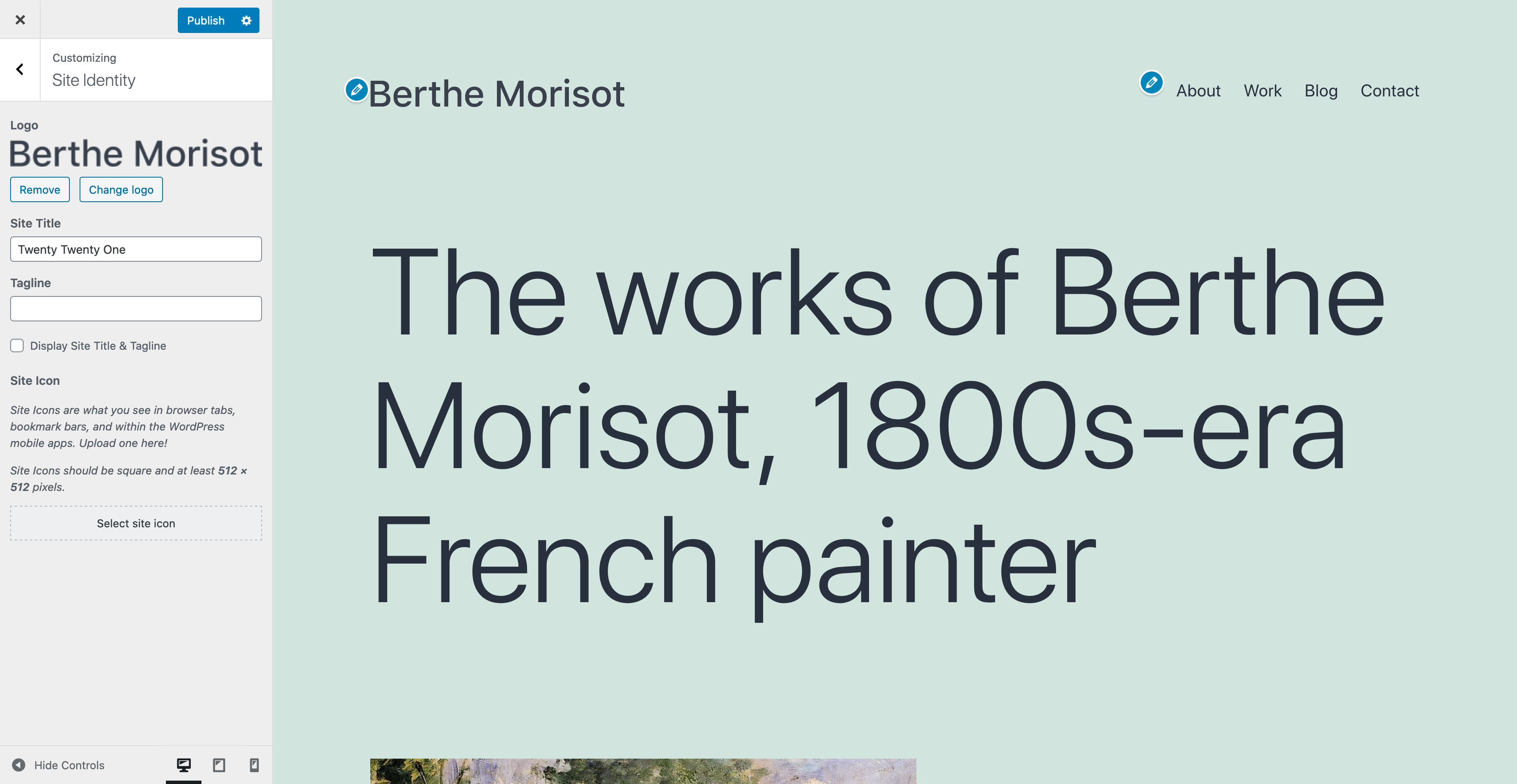
Site Logo
Twenty Twenty-One includes a site logo setting which can be used to display the logo of your business or an image of yourself. You can set your site logo by going to Customizer Site Identity.
The recommended size of the logo is at least 300px wide, or at least 100px tall. The logo is visible in the header and footer.
The logo in the site header is centered. If you want to hide the Site Title and Tagline, the logo is placed to the left of the menu:
Excerpt settings
In the Customizer you will find a panel called Excerpt Settings:

Here you can choose if the blog and archive pages should show the full content or only the summary.
The default is summary. The search result page always shows the summary.
When the summary is selected, only text will be displayed.
Menus
Twenty Twenty-One includes two menu locations:
- A traditional responsive horizontal menu at the very top of the site, which supports dropdown menus.
- A horizontal menu between the widget area and the footer at the bottom of the screen, which only supports one level of navigation.
You can choose a menu location by going to Appearance Menus, where you can assign a menu to the “Primary Navigation” or the “Footer Navigation”. You can also use both menu locations in combination, if you prefer.
Menu descriptions
The primary navigation menu supports menu descriptions.

To enable menu descriptions, go to Appearance Menus, and open the Screen Options tab at the top of the page.
Under Show advanced menu properties, check the box for Description:

Add a description by selecting the menu item and filling out the Description textarea. Remember to save your changes.

Add Social Icons
There are two ways to add social icons in your site:
- Use the Social Icons block within the editor.
- Add a link to a social media site to your footer menu.
When you create a social menu, the text label you provide will be hidden, and an icon will be shown in its place. If you’re not familiar with this functionality, please check out the documentation from Twenty Fifteen.
Twenty Twenty-One provides icons for the following social media services:
- 500px
- Amazon
- Bandcamp
- Behance
- Codepen
- DeviantArt
- Dribbble
- Dropbox
- Etsy
- Feed
- Flickr
- Foursquare
- GitHub
- GitLab
- Goodreads
- Kickstarter
- JSFiddle
- Last.fm
- Mastodon
- Medium
- Meetup
- Skype
- Snapchat
- SoundCloud
- Spotify
- Tumblr
- Twitch
- Vimeo
- VK
- WordPress
- Yelp
- YouTube
Additional icons can be added following the steps under “Adding icons in Twenty Twenty” at Themes field guide: WordPress 5.5.
Widgets
Twenty Twenty-One comes with support for one widget area, at the very bottom of each page. Each widget column is 33% of the site width, up to 380px.

Post formats
Twenty Twenty-One has support for post formats.
Post formats are selected in the editors Settings sidebar Post Status & visibility.
- Standard
- Aside
- Gallery
- Link
- Image
- Quote
- Status
- Video
- Audio
- Chat
Language Support
Twenty Twenty-One includes styles for RTL languages.
The theme uses a native system font stack. This font stack provides support for a large number of languages.
-apple-system, BlinkMacSystemFont, "Segoe UI", Roboto, Oxygen-Sans, Ubuntu, Cantarell, "Helvetica Neue", sans-serifExpand this list to see the fonts used for non-Latin languages.
- ar, ary, azb, ckb, fa-IR, haz, ps: Tahoma, Arial, sans-serif.
- zh-CN: PingFang SC, Helvetica Neue, Microsoft YaHei New, STHeiti Light.
- zh-TW: PingFang TC, Helvetica Neue, Microsoft YaHei New, STHeiti Light.
- zh-HK: PingFang HK, Helvetica Neue, Microsoft YaHei New, STHeiti Light.
- bel, bg-BG, kk, mk-MK, mn, ru-RU, sah, sr-RS, tt-RU, uk: Helvetica Neue, Helvetica, Segoe UI, Arial, sans-serif.
- bn-BD, hi-IN, mr, ne-NP: Arial, sans-serif.
- el: Helvetica Neue, Helvetica, Arial, sans-serif.
- gu: Arial, sans-serif.
- he-IL: Arial Hebrew, Arial, sans-serif.
- ja: sans-serif.
- ko-KR: Apple SD Gothic Neo, Malgun Gothit, Nanum Gothic, Dotum, sans-serif.
- th: Sukhumvit Set, Helvetica Neue, Helvetica, Arial, sans-serif.
- vi: Libre Franklin, sans-serif.
Dark Mode Support
One of the accessibility features of the Twenty Twenty-One theme is support for the visitor’s color scheme preferences in their operating system or browser’s settings. The feature is opt-in and supported in most operating systems, including Android, iOS, OSX, Windows 10, as well as most Linux distributions.
If you have Dark Mode enabled, your site will be shown to visitors using a light or dark color scheme, respecting their operating system’s preferences. Depending on their lighting conditions or personal preferences they may choose to switch color schemes using a dedicated button on the bottom-right of their site (or bottom-left for RTL languages).
Enabling Dark Mode from the Customizer
To activate Dark Mode Support, you can go to the Colors & Dark Mode section in your Customizer. If you have a light color selected for the site’s background, you will be able to see and activate the Dark Mode Support setting. The background color you select will be applied to light mode, while Dark Mode colors are optimized automatically. You can use the Dark Mode On/Off button at the bottom of the preview screen to toggle between dark & light schemes in your preview.
Dark Mode in the Editor
The editor will by default respect your operating system’s color scheme settings. If on the front of your site you have chosen a different scheme (using the Dark Mode On/Off button), then the editor will use the preferred scheme.

Support and Resources
Get community help with Twenty Twenty-One in its support forum.
You can also read the theme’s changelog.
]]>
Quick Specs
- On a 1440px laptop screen, the main column width is up to 580px wide. The “Wide” block width is up to 1200px wide, and the “Full” block width extends the entire width of the screen.
- There are two widget areas in the footer with a maximum column width of 570px.
- The recommended Featured Image size is 1980px wide by 1485px high.
Starter Content
Twenty Twenty contains Starter Content that helps to set up the theme identical to the theme demo page. The Starter Content can only be activated on freshly installed sites that do not have any pages or posts yet. To activate, please head over to the Customizer and click on Publish.
Full Block Editor Support
Twenty Twenty is designed and developed to take maximum advantage of the creative freedom enabled by the block editor. Extra care has been given to the Columns and Group blocks, which can be combined into impressive landing pages with intricate blocks layouts. Twenty Twenty includes full editor styles for the block editor, so what you see in the editor will almost exactly match the end result.

Site Logo
Twenty Twenty includes a site logo setting which can be used to display the logo of your business or an image of yourself. You can set your site logo by going to Customizer Site Identity. The recommended resolution of the logo is 240px wide by 180px high.
Custom Colors
Twenty Twenty includes three color settings that make it easy to give your site a personal touch. To change the color settings, navigate to Customizer Colors.

The color settings included in Twenty Twenty are:
- Background Color (defaults to a light beige)
- Header & Footer Background Color (defaults to white)
- Primary Color (defaults to pink)
The colors of the elements on your site are automatically calculated based on the background colors you pick. This ensures that the color contrast is always high enough to be accessible to all visitors.
Cover Template
Twenty Twenty includes a page template called the “Cover Template” that displays the title of the post or page on top of the featured image.

You can set a post or page to use the cover template by editing the post or page, selecting the “Document” tab in the right sidebar, expanding the “Post/Page Attributes” tab, and selecting “Cover Template” in the “Template” dropdown.
Twenty Twenty includes a number of different options for the Cover Template, located in the “Cover Template” tab in the Customizer. Here, you can set the background color of the image overlay, the opacity of the image overlay, and the color of the text displayed on top of the overlay. You can also select whether the background image should have a fixed position when the visitor scrolls, which creates a gentle parallax effect.
Language Support
Twenty Twenty includes optimal font styles for many languages, thanks to feedback from the WordPress community. The theme uses local system fonts by default and makes adjustments to the typography for the following alphabets:
- Arabic
- Chinese
- Cyrillic
- Devanagari
- Greek
- Gujarati
- Hebrew
- Japanese
- Korean
- Thai
- Vietnamese
Menus
There are two different desktop menus to choose from in Twenty Twenty:
- A traditional horizontal menu, which is always visible
- An expandable menu, which is hidden behind a menu button
You can choose which menu location to use by going to Appearance Menus, where you can assign a menu to the “Desktop Horizontal Menu” or the “Desktop Expanded Menu”. You can also use both menu locations in combination, if you prefer.
Twenty Twenty also includes a footer menu, which is displayed beneath the site content, and a mobile menu, which defaults to the menu set to either the desktop horizontal menu or the desktop expanded menu.
Widgets
Twenty Twenty includes two widget areas below the site content and above the footer.

On screens larger than 699px wide, widgets in this area are automatically arranged into two columns.

Add Social Icons
Twenty Twenty includes a Social Icons Menu, where you can add links to your social media profiles that will be displayed as logos in the footer. If you’re not familiar with this functionality, please check out the documentation from Twenty Fifteen.
The following services are supported by Twenty Twenty’s Social Icons Menu:
- 500px
- Amazon
- Bandcamp
- Behance
- Codepen
- DeviantArt
- Dribbble
- Dropbox
- Etsy
- Feed
- Flickr
- Foursquare
- GitHub
- GitLab
- Goodreads
- Kickstarter
- JSFiddle
- Last.fm
- Mastadom
- Medium
- Meetup
- Skype
- Snapchat
- SoundCloud
- Spotify
- TikTok
- Tumblr
- Twitch
- Vimeo
- VK
- WordPress
- Yelp
- YouTube
Additional icons can be added following the steps under “Adding icons in Twenty Twenty” at Themes field guide: WordPress 5.5.
Support & Resources
Get community help with Twenty Twenty in its forum.
You can also read the theme’s changelog.
]]>
Quick Specs
- On a 1440px laptop screen, the main column width is up to 1032px wide with the one column layout.
- There is one widget area in the footer with a column width of 1032px.
- The recommended Featured Image size is 2000px wide by 1200px high.
Full Block Editor Support
The block editor introduced in WordPress 5.0 grants users an unprecedented level of freedom to customize their site’s layout and design. In order to fully achieve their vision, users will need a new generation of flexible themes, built to take advantage of the creative freedom that the block editor offers. Twenty Nineteen is built with this in mind and includes both front-end and editor styles for all core blocks that ship with WordPress in 5.0. This means that what you see in the editor will look almost exactly like what you see on the front end.

Site Logo
Twenty Nineteen supports a Site Logo which works great as an avatar for a personal blog or an business logo or icon. To modify it on your site, navigate to Customizer > Site Identity.
Custom Colors
Twenty Nineteen uses a blue accent color by default. That color can be customized using a color hue slider. To explore the color options, navigate to Customizer > Colors.

By default, Twenty Nineteen applies a color filter to featured images using the color selected here. This can be disabled by deselecting the “Apply a filter to featured images using the site’s primary color” checkbox. Please not that when this option is disabled, the theme will still apply a black overlay on the featured image on single pages, in order to preserve the readability of the text that sits on top of the image.
Language Support
Twenty Nineteen includes optimal font styles for many languages, thanks to feedback from the WordPress community. The theme uses local system fonts by default and makes adjustments to the typography for the following alphabets:
- Arabic
- Chinese
- Cyrillic
- Devanagari
- Greek
- Gujarati
- Hebrew
- Japanese
- Korean
- Thai
Widgets
Twenty Nineteen includes a widget area below the site’s content, just above the footer.

On screens larger than 1168px wide, widgets in this area are automatically arranged into two columns.

Add Social Icons
Twenty Nineteen includes a Social Icons Menu, where you can add links to your social media profiles that will be displayed as logos in the header. If you’re not familiar with this functionality, please check out the documentation from Twenty Fifteen.
The following services are supported by Twenty Nineteen’s Social Icons Menu:
- Behance
- Codepen
- DeviantArt
- DockerHub
- Digg
- Dribbble
- Dropbox
- Flickr
- Foursquare
- GitHub
- Google+
- Meanpath
- Medium
- Periscope
- Skype
- SlideShare
- Snapchat
- SoundCloud
- Spotify
- StumbleUpon
- Tumblr
- Twitch
- Vimeo
- Vine
- VK
- WordPress
- Yelp
- YouTube
Support & Resources
Get community help with Twenty Nineteen in its forum.
You can also read the theme’s changelog.
]]>
Quick Specs
- The main column width is up to 525px for the two-column layout and 740px for the one-column layout.
- The sidebar column width is up to 326px.
- The recommended size for featured images is 2000px wide by 1200px high.
- The recommended size for header videos and header images is 2000px wide by 1200px high.
Header Media
Twenty Seventeen supports both header images and header videos. To modify either type on your site, navigate to Customizer > Header Media.

For header videos, you can upload your own mp4 video or link to a video hosted on YouTube. Smaller file sizes will help make sure your site is loaded quickly.
A header image can be used on its own to display a large photograph at the top of your site. It can also be used as a video fallback: If both a video and image are added, the image will be used as a placeholder while the video loads, and it also acts as a fallback on smaller screens where videos may be harder to serve over mobile networks.
Front Page
Twenty Seventeen allows you to build a striking front page composed of content from different pages on your site. Each page’s featured image is highlighted, displayed at full-screen size with a fixed position. Twenty Seventeen has four different sections you can assign pages to.
To set this up, first navigate to Customizer > Static Front Page, and set your site to use a static front page if you haven’t already.

Navigate to Customizer > Theme Options. Under each Front Page Section # Content header, select a page you’d like to display for that section.

If you haven’t created any pages yet, you can do that from the Customizer by clicking + Add New Page beneath any of the sections. This will allow you to create a new page from the Customizer that you can later add content to.
For the best appearance, make sure each page includes a featured image and some content.
You can also select your Blog Posts page, and the panel will display your three latest blog posts.

Once you’ve finished adding pages to the sections, click Save & Publish.
If you’d like to change the number of sections you can add pages to, add this snippet to your theme’s functions.php:
add_filter( 'twentyseventeen_front_page_sections', 'prefix_custom_front_page_sections' );
function prefix_custom_front_page_sections( $num_sections ) {
    return 6;
}
This snippet changes the default four sections to six.
Custom Colors
Twenty Seventeen includes three color options: the default light color scheme, a dark color scheme, and a Custom Colors scheme that can be adjusted to various hues using a slider.

To explore all the color options available, navigate to Customizer > Colors.
Language Support
Twenty Seventeen includes optimal font styles for many languages, thanks to feedback from the WordPress community. The theme uses Libre Franklin by default and makes adjustments to the typography for the following alphabets:
- Arabic
- Chinese
- Cyrillic
- Devanagari
- Greek
- Gujarati
- Hebrew
- Japanese
- Korean
- Thai
To improve legibility, Twenty Seventeen also removes its letter-spacing styles for all non-Latin alphabets.
One- and Two-Column Layouts
For pages, Twenty Seventeen allows you to choose between a one- and two-column layout. This can be changed via Customizer > Theme Options. The theme defaults to the two-column layout, which displays the page title in one column and the page content in the other.
Note: This feature only becomes available after setting a static front page.

When the one-column layout is selected, both the page title and content display in a wider single column, centered on the page.


Widgets
Twenty Seventeen includes a footer widget area allowing widgets to be added below the site’s content.
The blog index, archive, and search pages and single blog posts also include a sidebar widget area. For each of these pages, the content is displayed in one center column if there is no sidebar. With the sidebar, the content is displayed in one column and the widgets are displayed in the other.
Pullquotes
Pullquotes can be used to direct your readers’ attention to a particular passage or add visual interest to your posts and pages. In Twenty Seventeen, you can pair a pullquote with an alignleft or alignright class on the blockquote element to further highlight it. Instructions on how to do this can be found in the support article for the Classic Editor. See the following example:
<blockquote class="alignleft">This is my fabulous left-aligned pullquote.</blockquote>
When a two-column layout is used (whether via the Customizer for pages, or by adding a sidebar widget for posts), the pullquote aligned to the same side will display fully outside of the content area and below the second column. Note: This will only work when the pullquote appears in the content below where the second column ends.

Post Formats
Twenty Seventeen supports the following post formats:
- Aside
- Audio
- Gallery
- Image
- Link
- Quote
- Video
Social Icons
Twenty Seventeen includes a Social Icons Menu, allowing you to add links to your social media profiles that will be displayed as logos in the footer. If you’re not familiar with this functionality, please refer to the documentation from Twenty Fifteen.
The following services are supported by Twenty Seventeen’s Social Icons Menu:
- Behance
- Codepen
- DeviantArt
- Digg
- Dribbble
- Dropbox
- Flickr
- Foursquare
- GitHub
- Google+
- Meanpath
- Medium
- Skype
- SlideShare
- Snapchat
- SoundCloud
- Spotify
- StumbleUpon
- Tumblr
- Twitch
- Vimeo
- Vine
- VK
- WordPress
- Yelp
- YouTube
Support and Resources
Get community help with Twenty Seventeen on its forum.
Get tips for theming with Twenty Seventeen from this post on make.wordpress.org by one of Twenty Seventeen’s developers. You can also read the theme’s changelog.
]]>
Twenty Sixteen is a modernized take on an ever-popular WordPress layout — the horizontal masthead with an optional right sidebar that works perfectly for blogs and websites. It has custom color options with beautiful default color schemes, a harmonious fluid grid using a mobile-first approach, and impeccable polish in every detail. Twenty Sixteen will make your WordPress look beautiful everywhere.


Quick Specs
- The main column width is up to 840px.
- The sidebar column width is up to 300px.
- The recommended Featured Image size is 1200px wide.
- The recommended Custom Header image size is 1200px wide and 280px height.
No-Sidebar Layout
If you’d like to keep your visitors’ focus squarely on your content, simply don’t add any widgets to the sidebar widget area. This also allows you to give your posts a powerful visual boost by adding a large Featured Image, up to 1200px wide.

Content Bottom Widget Areas
Twenty Sixteen’s two Content Bottom Widget Areas are handy spots where you can place supplementary content. On single posts and pages, these widget areas display below your content. To add widgets to them, Click Appearance > Widgets from the Administration Screen and add your favorite widgets to Content Bottom 1 or Content Bottom 2 or both.

Post Intro
Twenty Sixteen has a small but nifty intro feature. Also known as a “deck” or “kicker,” the intro area is displayed between the headline and body copy. Your intro can provide important information and act as a link between the title and the rest of your post. A carefully crafted deck grabs readers’ attention, giving them an idea of what to expect in the full post.
Add your intro in the Excerpt option in your Post panel.
Overhanging Full-Size Image
Have you ever wanted to show off your large images without sacrificing the post’s readability? On a large screen, full-size images wider than or equal to 840px overhang the column.
Pull Quotes
Pull quotes are a great way to refocus your readers’ attention — just add a class of alignleft or alignright to a blockquote element. Here are some examples of how to do that in the Classic Editor.
<blockquote class="alignleft">A bolder pull blockquote that aligns to the lef</blockquote>

<blockquote class="alignright">A bolder pull blockquote that aligns to the right</blockquote>
On a large monitor, the left-aligned pull quote overhangs the main column to maintain the readability of the text wrapped around it.

Customize
Open the Customizer to check out the four featured color schemes you can use to instantly change the look of your website.
- (Default)
- Red
- Gray
- Dark
- Yellow
Personalize the design even further by adding a Custom Header Image or/and Site Logo.

Social Menu
With Twenty Sixteen, you can display links to your social media profiles with perfectly sized icons in the footer, using the Social Links menu. You can manage menus under Appearance > Menus.
Linking to any of the following sites will automatically display its icon in your menu:
- CodePen
- Digg
- Dribbble
- Dropbox
- Email (mailto: links)
- Flickr
- Foursquare
- GitHub
- Google+
- Path
- Polldaddy
- RSS Feed (urls with /feed/)
- Spotify
- StumbleUpon
- Tumblr
- Twitch
- Vimeo
- WordPress
- YouTube
Links
]]>Twenty Fifteen looks great on devices of all sizes, from desktop to mobile and everything in between. The theme adapts to any screen without sacrificing usability or design integrity.

Quick Specs (all measurements in pixels)
There are a few ways that you can customize Twenty Fifteen, all from WordPress’ Customizer. This short guide will show you how to:
- choose a featured color scheme
- add descriptions to your menus
- add social icons in your menu
- add block patterns
Choose a featured color scheme
Twenty Fifteen has six color schemes you can use to change the look of your blog. The Default color scheme is a light gray, but you can also choose from Dark, Yellow, Pink, Purple, and Blue.

To choose your color scheme, go to Appearance > Customize.
Under “Colors”, select your preferred color scheme from the drop down:

You’ll see the color scheme change in the preview pane to the right.
When you’re done, click Save and Publish.
Add Menu descriptions
Twenty Fifteen has a menu design that’s easy to navigate, especially when you add menu descriptions.

To start adding descriptions to your menus, go to Appearance > Menus and click the Screen Options tab in the upper right of the screen.
In the “Show advanced menu properties” section, check the box next to Description.

Now you can begin adding descriptions to any link in a menu.

When you’re done, click Save Menu.
Add social icons
Twenty Fifteen also allows you to display links to your social media profiles with crisp, perfectly-sized icons.
You can see these icons at the bottom of the menu displayed in the previous section.
The first step is to go to Appearance > Menus and create a new menu – you can name your menu anything you like.
You will then add the URL for each social profile to your menu as a custom link.
When you have added all desired links, click Save Menu.
Now that you have created your menu and added your social links, go to the Manage Locations tab and next to “Social Links Menu”, select the social icons menu you just created from the drop down.
Click Save Changes when you’re done.
Available icons
Linking to any of the following sites will automatically display its icon in your menu:
- CodePen
- Digg
- Dribbble
- Dropbox
- Email (mailto: links)
- Flickr
- Foursquare
- GitHub
- Google+
- Path
- Polldaddy
- RSS Feed (URLs with /feed/
- Spotify
- Skype
- StumbleUpon
- Tumblr
- Twitch
- Vimeo
- WordPress
- YouTube
Add Block Patterns
Twenty Fifteen comes bundled with a set of block patterns.
You can access the block patterns from the Block Editor.
- Click the + icon to add a new block.
- Click on the Patterns tab.
- Select Twenty Fifteen from the drop down menu.
- Click on the pattern you wish to insert and the pattern is inserted in the document at the location of your cursor.

What else can you do?
You can also use the Customizer to make the following changes to your website:
- Change your Custom Header image
- Featured Images: works best with images that are 825px wide by 510px high
- Change the background image or color
- Set a static front page
You can also select a gradient option for certain blocks that fit the theme color scheme:
